Pet•Mode: Streamlining Pet Management with a Mobile App
Project Overview
There has been a significant growth of pet ownership, with millions of households across the world welcoming furry companions into their lives. As the responsibilities associated with pet care grow, so does the need for effective pet management tools. With tasks such as feeding, grooming, and medical care, pet owners often find it challenging to keep track of their pet's needs. Additionally, the pet industry is a lucrative market, making it ripe for innovation and growth.
We set out to create a user-friendly mobile app that could help pet owners manage various aspects of pet care, from tracking vaccination schedules to being able to store and access pet-related information.
Objective
Streamlined Information: Provide pet owners with a centralized platform for storing and accessing pet-related information.
Reminders and Alerts: Implement reminders for tasks such as feeding, grooming, and veterinary appointments.
Health Tracking: Enable users to maintain health records, including vaccinations, medications, and medical history.
Secondary Research
Is there a need for pet management apps?
Who are using mobile apps?
What are the current apps being used for?
Secondary Research: Pet Ownership Statistics
According to the American Pet Products Association’s 2021-2022 National Pet Owners Survey, 70% of American households owned a pet equaling 90.5 million U.S. households.
Secondary Research: Pet Ownership Age Groups
Based on the American Pet Products Association’s 2021-2022 National Pet Owners Survey, millennials make up the largest group of pet owners in the United States. APPA found that Millennials and Gen Z spent more money on their pets with 62% being Millennials and 52% of Gen Z increasing their spending.
Generation X is anyone born from 1965 to 1980.
Baby boomers are anyone born from 1946 to 1964.
Millennials are anyone born from 1981 to 1996.
Generation Z is anyone born from 1997 to 2012.
Secondary Research: Pet App Usage
According to App IQ from 2021-2022 the average pet app usage grew from about 16 minutes to 28 minutes. This shows that pet owners are relying more on apps for their pet care needs.
Secondary Research: Top Pet Apps
In 2022 app downloads and active users continues to grow along with pet ownership.
Secondary Research: Pet Tech Market
The pet tech market is projected to grow from USD 8.40 billion in 2021 to USD 61.20 billion in 2030. Due to the growth in using digitally connected products and pet management mobile apps.
Secondary Research Insights
With the research conducted, we can see that the growth in pet ownership has had an effect on the amount of downloads and usage in pet associated apps.
The apps range from online pet stores, dog walker locator, pet tracking and a pet health apps.
PetDesk is the only organizational tool on the list. It doesn’t have the ability to share pet information, the owners and is more of a patient portal app than a pet information app.
With the growth in pet ownership and app usage we can conclude there is a need for a more user intuitive app that combines the capability to easily share a pets’ data with multiple caretakers along with the pet management needs of the modern pet owner.
Primary Research
Social media was used to recruit volunteers for the screener survey. It was available for one week and we received thirteen screener surveys. A total of five participants were selected for interviews. Interview lengths varied between 10-15 minutes. Each participant is a pet owner that uses a pet centered app. Throughout the interviews they explained their experiences using various applications. The objective was to learn of any pain points, what they found useful and how they kept track of their pets information.
Thematic Analysis: Themes
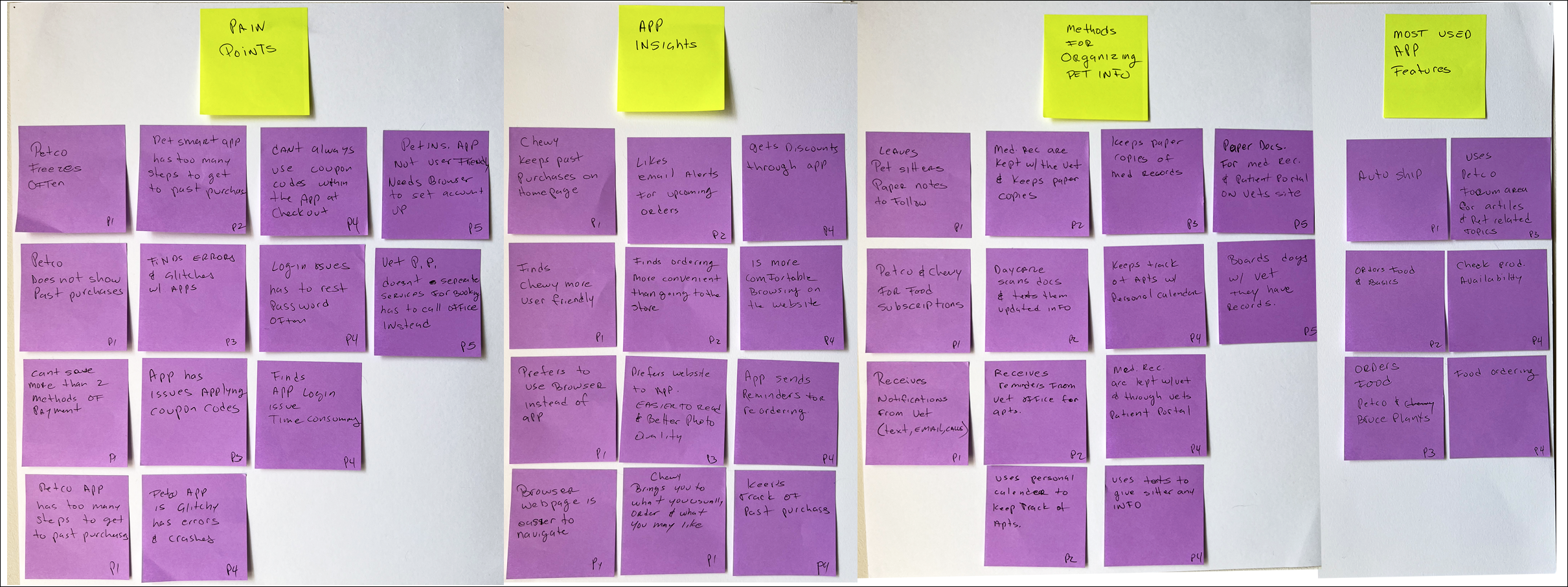
After interviewing the participants notes were created for each interview. The interview notes were separated into key findings and observations with the following themes:
Pain points: Participants had similar experiences with using the Petco and PetSmart app. They found it to be glitchy and freeze/crash while in use. They also stated that there were too many steps to get to their past purchases which they found time consuming.
App insights: Participants seemed to prefer to use the websites over the apps. They found the website easier to navigate as they didn't have the freezing or crashing issues experienced with using the app.
Methods of organizing pet information: Most participants kept paper copies of their pets important documents, medical records or used the vet’s patient portals. To keep up with the their pets appointments they received reminders via text, email or a phone call from the vet’s offices.
Most used app features: All participants used apps for ordering pet food and auto deliveries. Other uses were checking in store product availability and using the forum area for keeping up to date with products and pet related topics.
Thematic Analysis Insights
Participants had similar reasons for using the apps, mainly for ordering pet food and auto deliveries. While also experiencing similar pain points with using them, glitches, crashing and requiring too many steps to get to their desired task. Participants do find the apps useful in keeping track of what foods they are ordering and discovering new products. But still find the stores websites easier to navigate.
Participants kept paper copies of their pets medical records and when available used their vet’s web based patient portals. They mostly relied on their vet’s office to send appointment reminders. When using a pet sitter or daycare the participants gave them written directions or used text to communicate and pet information.
Data Synthesisation
With the data that we gathered from the interviews, secondary research and with the affinity maps we were able to create empathy maps of our users.
User Personas
Using the qualitative data from our interviews, affinity maps and empathy maps we’ve learned who our users are, how they use the product, and what they need along with what their frustrations are.
Jobs-To-Be-Done
After creating the user personas from the participants of our interviews we can determine what outcomes the user wants with the JTBD method. The JTBD list helps us discover the outcomes our users want while using a pet centred app. Participants from different age groups and lifestyles have differentiating needs and frustrations from using the apps along with similar ones.
Job Performer:
Ernest Collins
Main Job:
Receive reminder notifications
Emotional Job:
Feel inspired to make new product purchases
Needs:
Alerts before a recurring order is charged
Receive new product information
Circumstances:
When they’re using a app
Job Performer:
Sofia James
Main Job:
Make purchases
Emotional Job:
Not feel like you’re wasting your time
Has a hard time seeing search results
Needs:
Spend less time searching for products
Circumstances:
When they’re using a app
HMW Problem Statements
With the synthesized data from the interview notes, affinity diagrams, empathy maps and user personas we created HMW problem statements.
The HMW problem statements asked were key issues our users experienced with using pet centered apps. We need to find solutions for these specific problems in order to give our users a positive experience with using the apps and help them achieve their goal.
How might we create less steps to get to past purchases?
How might we provide alerts/notifications for product orders?
How might we make the app easier to navigate?
How might we keep the app from crashing?
Solution Ideation
After going over our synthesized data from our initial interview notes, affinity diagrams, empathy maps and user personas we have come up with a few HMW problem statements.Here we attempt to solve our HMW problem statements.
HMW Problem Statements: Solution Idea
How might we provide alerts/notifications for product ordering?
Have a pop up window asking to change notifications.
Give users the option at check out to change alerts settings for orders.
Have a alert/notification button in the account menu.
Email the user asking to update preferences.
How might we create less steps to get to past purchases?
After the user signs in a pop up window with the option to express add items to cart.
After the user signs in a separate section updates with past purchases with the option to add items to cart.
How might we have easier to see product photos?
Have high resolution and a larger scale of product photos displayed.
Add a quick view option which a window pops up that displays larger product images and product information.
Give users the option to change the layout of the product page from list to blocks.
MVP User Stories
MVP user stories help prioritize development efforts and ensure that the most critical features are implemented first.
Sitemap
The M.V.P. user stories were used to create a sitemap with the four pages a user would need to easily navigate a website/app.
My Pet- Pet owners can create a pet profile and upload adoption documents.
Reminders- A calendar page where a pet owner can see their upcoming appointments and reminders.
Health/Wellness- Medical information along with diet.
About- Site information and faqs. Also a page for blogs.
User Flows
With the data from the user personas and site maps we identified two red routes a user would make while using the app and made user flows for those tasks. Those user flows were for adding an appointment and making a pet profile.
Heuristic Analysis
A heuristic evaluation of our competitors products using the 10 usability heuristics developed by Jacob Nilsen and Rolf Molich. Heuristics are usability guidelines used in user interface design. With these heuristic guidelines we will assess each apps user interface and rate the experience. For this evaluation the following three heuristics were used .
Heuristic 1: Consistency and Standards
Follow established platform conventions to provide a consistent user experience.
Heuristic 2: Aesthetic and Minimalist Design
Interface should not contain information which is irrelevant.
Heuristic 3: Help and Documentation
Provide documentation to help users understand how to complete their tasks.
Competitors
We analyzed existing pet management apps to identify strengths and weaknesses. This helped us find opportunities for improvement and innovation. The competitors we analyzed are the following:
11pets Pet Care: A digital pet-care platforms where you can store your pet's medical history, maintain a schedule for vet visits, track your pet’s diet and nutrition, and share your pet’s medical history with its veterinarian or pet-sitter.
Petfetch: A pet information organizer. Receive medication notifications, appointments reminders. Keep track of vaccinations, weight graphs, and IDs.
Great Pet Care: A place for managing medical records, feeding instructions, reminders, and even cute photos.
Heuristic Analysis Insights
Using the Jakob’s Ten Usability Heuristics as a guideline for evaluating our competitors products we were able to discover usability issues and also gain inspiration for our own product.
A common issue with the applications evaluated was going against the heuristic of consistency and standards. They were inconsistent with how to add a pet or appointment and it was difficult locating the information on the screen that was dedicated to it. Making the user backstep to a previous screen therefore adding additional steps to the task they wanted to complete. We recommend keeping the user from jumping from screen to screen by having all required information in one area.
Heuristic Analysis Insights
Keeping the applications interface simple and minimalistic made using the application easier for a first time user. When the over use of icons and information was used it became overwhelming for the user. Having a screen cluttered with the repetition of icons is unnecessary. We want to minimize cognitive load by avoiding a cluttered screen.
The applications did provide the user with a help option when needed, even though not all were clear instructions. Our goal is to avoid the user having a issue that would require them to have further explanation in using the application.
Sketches
The red routes identified previously were used to create sketches of user flows for our app.
The two user flows were, creating an appointment and making a pet profile. These are two critical user flows a user would follow while using the app.
Wireframes
For the wireframes we used sketches of two user flows a user would make while using the app. Those user flows were for “creating a appointment” and “creating a pet profile”.
Guerrilla Usability Testing
A prototype was developed from the wireframes red routes. Using the interactive prototype to test the app's flow and functionality. Five different people tested the prototype at a event. This iterative process allowed us to refine the user interface.
Usability Test 1: Create A Appointment
We had the testers first try to complete the task of creating a appointment. Most of the users first tried to open the appointment form screen by hitting the day in the calendar, but it was not set up for that option. It did cause a bit of confusion for the user. After a few tries they did find the “+” symbol and used that to open the form to create a appointment.
Usability Test 2: Create a Profile
We asked the users to create a profile with the prototype. Most of them found it easy to use. They located the profile screen easily. But a couple did try to use the “+” symbol to create a new profile but that option was not there.
Guerrilla Usability Testing Insights
We found our usability testing to be quite helpful in finding different actions that seem to be intuitive for the users but were not available for them to use with the prototype. Such as having the option to create a appointment directly from the date on the calendar. Adding that option will help with the initial confusion with trying to get to the appointment form. With the task of making a pet profile users had a easy time reaching the form screen. A couple did try to make a profile by tapping the “+” symbol but that option wasn't there.
Overall the users provided helpful feedback and adding these options for the user will make the app much easier to use.
Edge Cases
Having identified the edge cases within our wireframes that disrupted the users interaction within the app allowed for improved usability throughout the application.
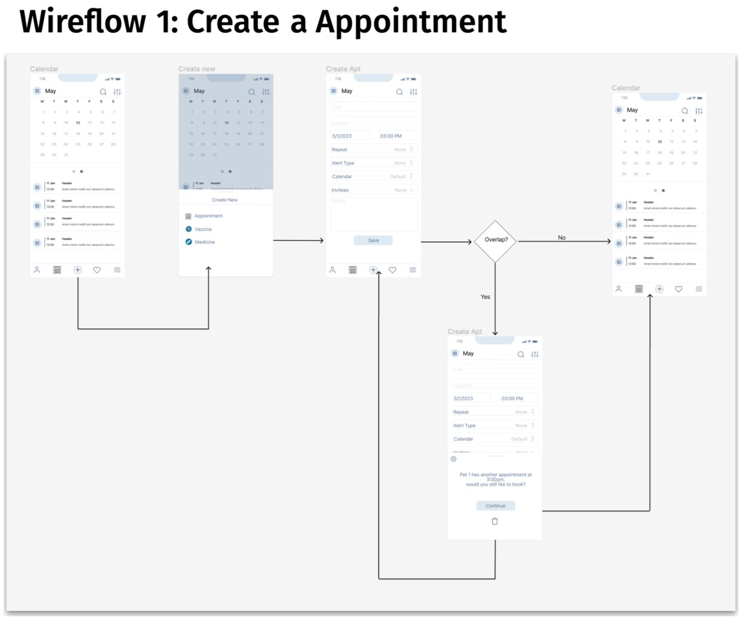
Alerting a user of overlapping appointments helps our users with scheduling conflicts and offers the option to keep creating the appointment or to edit/cancel.
We added the “forgot password” option which helps users with login issues and give them a way to recover their passwords.
Edge case 1: Overlapping Appointment
Within our “create a appointment” wireframes we identified the edge case of having overlapping appointments. A pop up screen was created to alert the user and give them the option to continue to create the appointment.
Edge case 2: Login screen
With our initial login wireframe screen we did not have a “forgot password” option. We added the option under the log-in area. When a user selects “forgot password” there is a popup area that gives the user a option enter their email. After the email is entered a new screen has the user enter a code that was emailed to them.
Wireflows
We created our wireflows using the data from red route user flows and wireframes. We also added our edge cases to demonstrate possible conflicts a user may come across.
Brand style Guide
Moodboard
Contrast Grid
High Fidelity Mockups
Prototype
Usability Test Report
We conducted usability tests with pet owners to gather feedback on the app's usability and overall experience. The app is designed to help pet owners manage their pets' information, appointments, and other pet-related tasks easily. The participants' actions, feedback, and any difficulties encountered during the test were observed and recorded. This report summarizes the findings and recommendations based on the usability testing sessions conducted.
The usability test was conducted in person with five participants who are pet owners and an age range of 30-60 years old. Each participant was given specific tasks to perform within the app. First task was to login and create a new pet profile and the second was to create a new event reminder. Each participant was able to complete the tasks.
Most participants used the “plus/add” icon in the tab bar to complete the tasks while a couple went directly to the “My Pet” or “calendar” icons to do so. An issue that the participants had was there wasn't a date option in the new event calendar form. Overall the participants found the app easy to navigate and “straightforward”.
Summary
We sought out to create a user friendly app for pet owners that will help them efficiently organize, care for their pets and ultimately enhance the overall pet ownership experience.
With the research conducted, we can see that the growth in pet ownership has had an effect on the amount of downloads and usage in pet associated apps. The apps range from online pet stores, pet sitting and pet health apps. After interviewing the participants we found that they had similar reasons for using the apps. While they kept physical copies of their pets important documents and medical records, when available they used their vet’s web based patient portals and pet shopping apps where they could store their pets information.
Pet•Mode received positive feedback from users, with many praising its user-friendly interface, reminder features and the ability to have their pets medical records accessible. We can conclude there is a need for a more user intuitive app that combines the capability to easily organize and share pets’ data along with the pet management needs of the modern pet owner.


